Data Source Items Widget
Add a read-only table widget to display items from an internal database or an external data source on a custom interface. You can use this widget to select a data source and entity, configure columns and filters, export data, and enable drill-down interfaces to view additional details for each record.
For information about how Tonkean sorts data in widget tables and other areas of the platform, see Understanding Sorting in Tonkean.
Title
Set the title of the widget. Include a descriptive title to help users understand the specific content of the widget.
Wrap title text
Select whether to wrap title text that extends beyond the available display width. When not selected, long titles are truncated with an ellipsis.

Description
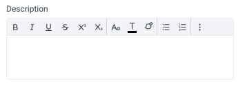
Add a description for the widget. This description displays below the widget title.
Show description as a tool tip
Select whether to display the widget description as a tool tip, hiding it by default.
When displayed as a tool tip, any rich text formatting in the description is removed.

Icon
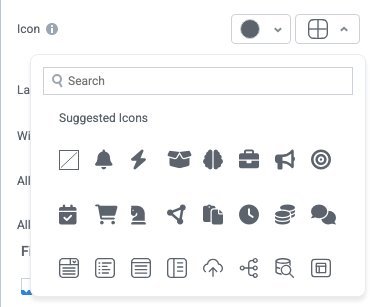
Change the widget icon and icon color—or remove the icon. Widgets always include a default icon.
Select the crossed-out icon option,  , to remove the icon.
Width
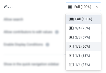
Set the display width of the widget.
The width settings of neighboring widgets determine the resulting display on the interface. For example, two neighboring widgets set to 50% width display side by side. Similarly, if one widget is set to 1/3 and the following widget is set to 2/3, the widgets will display side by side.
We recommend experimenting with widget width settings and widget placement to optimize the interface display for the screen size you're designing for. That is, if you're designing an interface for a large screen (say, a request tracking interface), you can use small widget widths and include multiple widgets together. However, if designing for mobile, leaving widgets at 100% widths is generally best.
Enable Display Conditions
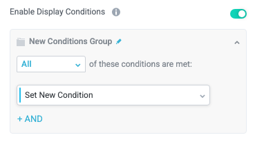
Select whether to dynamically display the widget based on custom conditions. When enabled, a conditions group displays; when the specified conditions are met, the widget displays.
For example, you can set a condition to display an input-type widget only if a user enters a specific value, prompting the user to provide additional information.
For more information about configuring condition groups, see Conditions.
Condition Evaluation Method
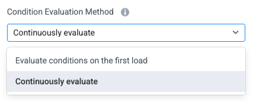
Set how display conditions are evaluated:
Evaluate conditions on the first load - Evaluate conditions only when the page first loads. This option does not dynamically show or hide relevant widgets when a user makes a selection; refreshing the page is required.
Continuously evaluate (default) - Continuously evaluate conditions as the user views and interacts with the interface. Use this option to enable the interface to dynamically show or hide relevant widgets based on user input.
Show as a quick navigation tab
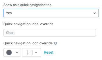
Select whether to display the widget as a quick navigation tab. When this option is set to Yes, this widget and all those below it will display on a single tab until the next widget that's configured to display as the quick navigation tab. Additionally, you can set the quick navigation menu label override and edit the label icon.
Fill available height when it's the only widget
Select whether the widget expands to fill all available height when this widget is the only widget on the interface.

Records
Configure the source, display style, and available options for the data source records.
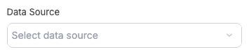
Data Source
Select the data source to display records from.
The data source must have access to the solution to display in this dropdown.
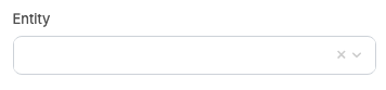
Entity
Select the data source entity to display records from. Available entities depend on the data source. For example, entities for a Google Drive folder would usually include Folder and File.
Filters
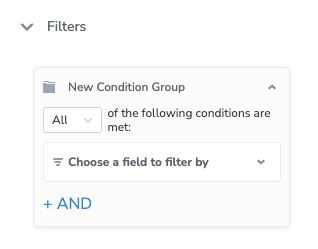
The Filters section defines which records from the selected data source display in the widget. This section appears after you select a data source and entity in Records.
Add a condition group using the selected entity's fields. Condition values can include expressions. The widget loads only the records that meet these conditions.
For more information about configuring condition groups, see Conditions.
Sort
Configure how data source items are sorted and displayed in the interface.
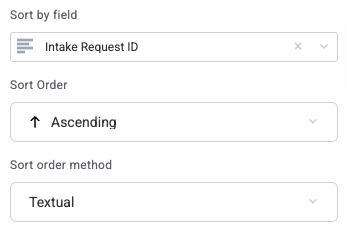
Sort by field
Select a field to sort the items by as a default.
When you select a field to sort by, additional options display for the Sort Order and Sort order method.
Options
Configure additional widget display and behavior options.
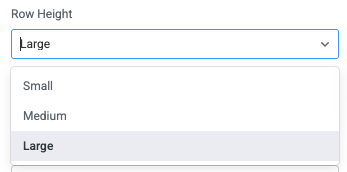
Row Height
Set the display height for each item row.
Enable column filters
Select whether to display the column filter option.

Enable advanced filters
Select whether to display the advanced filter mode, which allows users to enter complex filter conditions across columns in a single input.
The advanced filter can display fields that are included but deselected in the Table Fields section.

Enable export
Select whether to allow users to export filtered items in CSV format.

Allow scheduled exports
Select whether to allow users to schedule recurring CSV exports from the Data Source Items widget. This feature enables request data to flow into a configured storage provider or data lake on a set cadence.
When Allow scheduled exports is enabled, the Scheduled exports configuration section displays.

Enable pivot mode
Select whether to allow users to use pivot mode in the widget dropdown menu.

Enable charts
Select whether to enable users to create dynamic charts using item table data.

Scheduled exports
Configure a recurring CSV export of the widget's records to a storage provider. On the schedule you define, Tonkean generates a full snapshot of the records and saves it to the selected destination, such as a data lake. This removes the need to manually download the file and re-upload it each time.
This section displays only when Allow scheduled exports is enabled in the Options section.
Each field accepts a static value. To set a value dynamically, select the insert field button,  , to add a formula or a value from your solution preferences. This lets you reuse a single configuration across widgets and solutions.
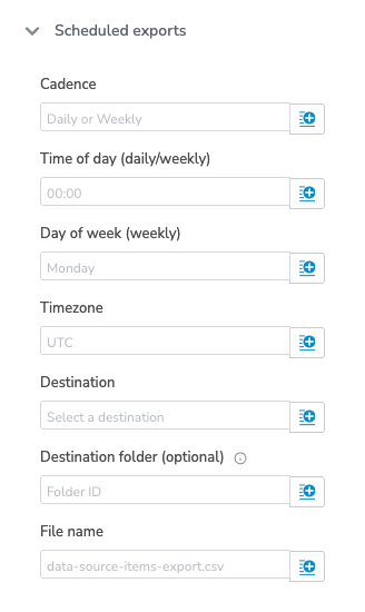
Cadence
Enter how often the export runs: Daily or Weekly.
Time of day (daily/weekly)
Enter the time the export runs in 24-hour format (HH:MM). For example, enter 14:30 for 2:30 PM. This setting applies to both daily and weekly cadences.
Day of week (weekly)
Enter the day of the week the export runs, such as Monday. This setting applies only when Cadence is set to Weekly.
Timezone
Enter the timezone for the scheduled time. The default is UTC.
Destination
Select the storage provider to receive the file: Amazon S3, Google Drive, or SharePoint.
Destination folder (optional)
Enter the ID of the folder where the file is saved. If you leave this field blank, Amazon S3 exports are saved to the root directory.
File name
Enter a name for the exported file, such as data-source-items-export.csv. If you don't include a file extension, Tonkean adds .csv automatically.
How Scheduled Exports Work
Tonkean runs scheduled exports on a background service that checks for due exports every 10 minutes. As a result, a file typically arrives in your destination 10–20 minutes after the scheduled time.
Each export contains a full snapshot of the widget's records. Exports larger than 5,000 rows are split into multiple files of up to 5,000 rows each. For example, a 10,000-row export produces two files.
To export only new records, such as a daily incremental snapshot, add a created-date filter (for example, the past day) to the data source before the export runs.
Module for Drilldown & Actions
Configure the module for item drilldown and additional actions.
Data Type
Select the type of data to display in the drill-down interface:
Tonkean Item
External data source record
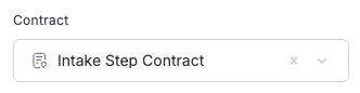
Contract
Define the available interfaces by selecting a module contract. All interfaces from modules using this contract will be available.
Module selection method
Select whether the module selection method is Static (as defined here) or is Dynamically evaluated.
If this option is set to Dynamically evaluated, an additional Module definition field displays. Use this field to define...
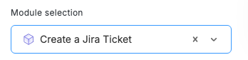
Module selection
When no contract is set, you can define the source of the drill-down interface by selecting the module directly. This option only displays when Module selection method is set to Static.
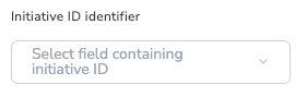
Initiative ID identifier
Select the data source field that contains the initiative ID. This field displays when Data Type is Tonkean Item, and the widget's data source and entity are configured.
Drill down item interface
Select whether to enable users to view the data source record in a drill-down interface.
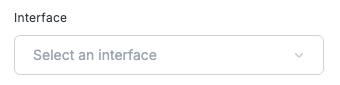
Interface
Select the interface to drill down into for the selected data source record. Available options are based on the selected module, contract, and so on, configured above.
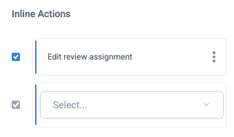
Inline Actions
Add actions users can initiate in-line on the inner item by selecting the options button,  .
.
Views
Configure view options for the widget.
Enable saved views
Select whether to enable saved views from the item table at the top of the widget. If enabled, saved views display as buttons at the top of the widget, enabling users to more easily switch between views.

Fields
Configure the fields that display in the widget, as well as display options.
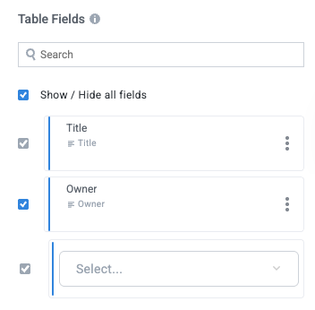
Table Fields
Select the module fields to display in the widget when items (or inner items) display as a table.
Configure Table Field Format
For each field, you can define the display format. This option ensures the best possible display for a wide variety of data source record types.
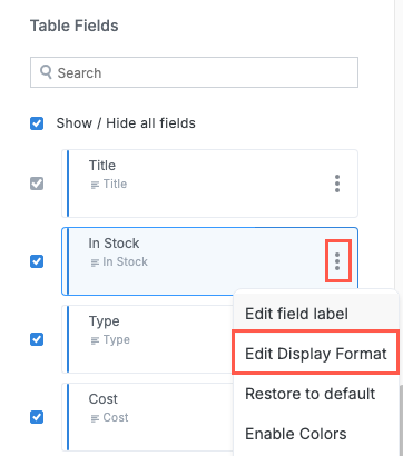
To define the field display format, select the options button, , and select Edit Display Format. The Field Format window displays.
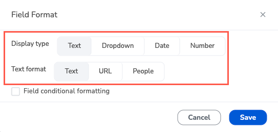
Select the Display type and Text format to best suit the data source record field type. Based on your selection, additional configuration options display to fine-tune the display format for the field value. When finished, select Save.
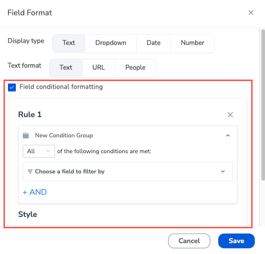
You can also set conditional formatting for the field. Enable Field conditional formatting, then select + Add rule. For each rule, define the condition and set the text color and background color. The preview shows the resulting style. Repeat for additional rules. When finished, select Save.
Additional Table Fields (JSON)
Include additional fields from a separate source using JSON. This option is designed to include fields from Preference tables or formula fields in JSON format. Select the insert field button, , to add formula fields or values from your solution preferences.

Row style rules
Style an entire row when a condition is met. Row style rules are separate from the formatting set on an individual field.
Enable Row style rules by turning on Enable advanced filters in Options.
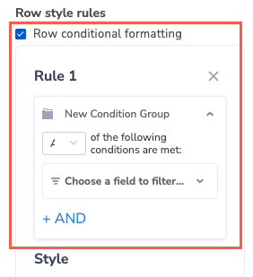
Turn on Row conditional formatting, then select + Add rule. For each rule, define the condition and set the text color and background color.
Additional row style rules (JSON)
Add more row style rules from a JSON array. Each object uses condition, style, and overrideCellStyle. Select the insert field button, , to supply the JSON from a formula or a solution preference.