Manual Fields
Manual fields are created directly in Tonkean and are not associated with a data source. Manual fields are most commonly created for forms or interfaces, where specific, customized fields may be needed. Forms can become quite complex and sequenced together, but they are ultimately a series of manual fields.
There are many use cases where manual fields are helpful. For example, if your module plans recurring events and you need to collect people's dietary restrictions or meal preferences, you can use manual fields in a form to collect that information.
To create a manual field, follow the steps below:
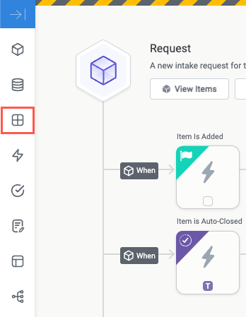
Select the main nav icon,
 , in the top left corner and select Solutions Studio. The Solutions Studio screen displays.
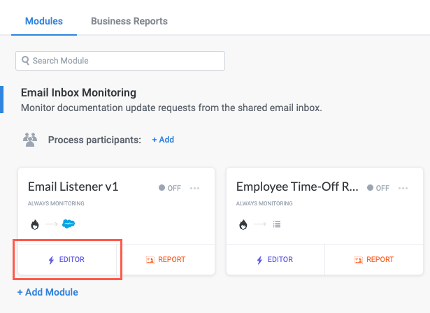
Select the module you want to create the manual field in and select Editor. The module builder screen displays.
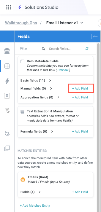
From the module builder screen, select the Fields button on the module builder toolbar. The Fields panel displays.
Beside Manual fields, select + Add Field. The Field Settings screen displays.
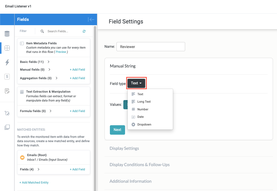
Enter a Name for the field.
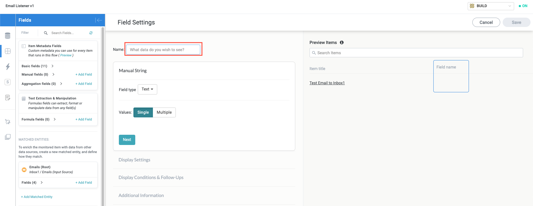
Select the Field type dropdown and select a field type for the field. The following options are available:
Text - Plain text field with a character limit of 500.
Long Text - Plain text field designed for large bodies of text, with a data size limit of 16MB (approximately 5,000,000 characters, depending on the language).
Number - Number field.
Date - Date field with a large variety of formats supported.
Dropdown - Dropdown field.
Additional options display depending on what value you select for Field type. For example, if you select Dropdown, there are several other fields you can configure in this section, in addition to entering the items for the dropdown. Follow the relevant configuration steps for your field type in the sections below.
Configure a Text, Long Text, Number, and Date Field
The setup and configuration for text, long text, number, and date-type manual fields follow the same general steps, though there are some minor differences between them, generally related to display formatting.
To configure a text, long text, number, or date field, follow the steps below:
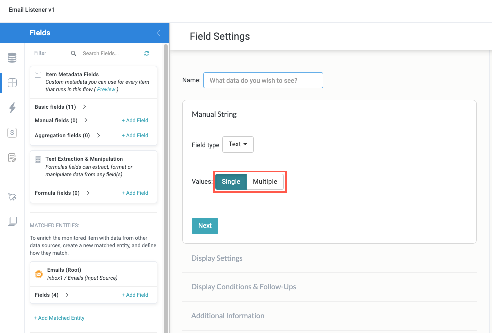
Select whether the field supports a single value or multiple value.
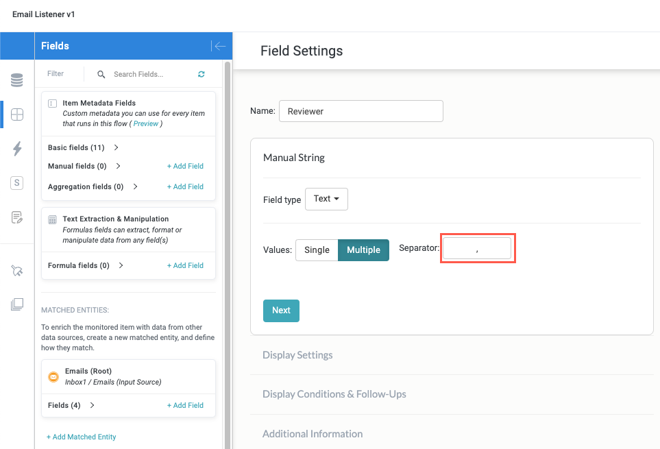
If you select Multiple, select the separator that displays between each value. The default separator is a comma (",").
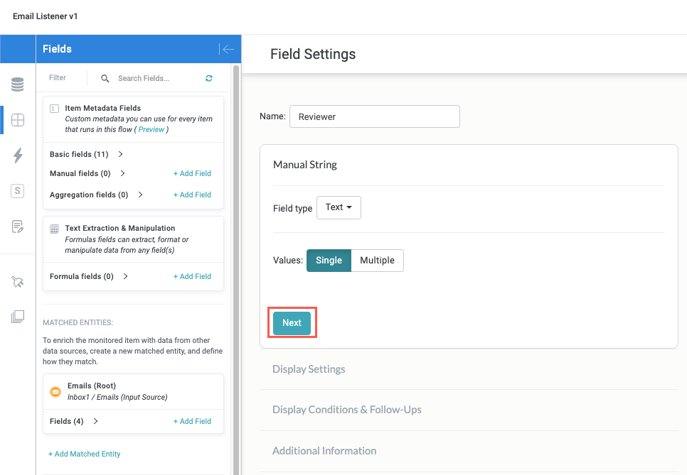
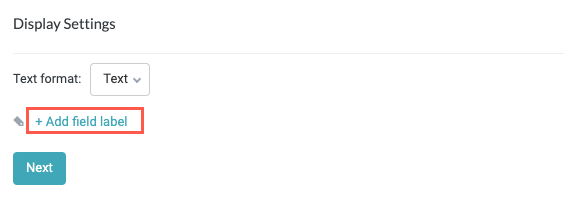
Select Next to move on to the Display Settings section.
The options available in the Display Settings section vary depending on your selections in the Data Sections section:
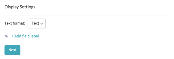
Text
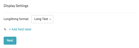
Long Text
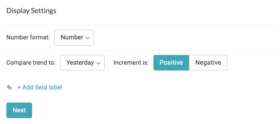
Number
Date
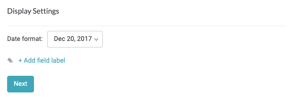
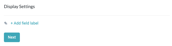
Select + Add field label to enter a brief and descriptive label for your field, then select Next to move on to the Display Conditions & Follow-Ups section.
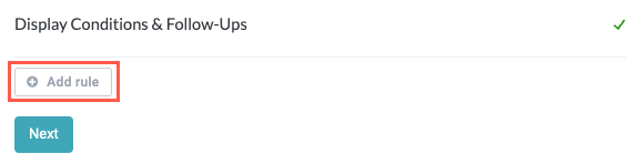
If relevant, select Add Rule to create a rule that determines the display condition and status of the field, based on a specified value. These conditions are useful when you need a module to display differently based on the particular value entered for the field.
Use the conditions dropdown to set the desired condition. For example, if you're creating a number field and you want to draw attention to an entered value that is equal to or less than
0in the related business report, you can configure that here. The default value is Equal to and the default color is Green.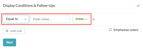
For more information about the conditions and logical operators, see Conditions.
When finished, select Next to continue to the Additional Information section.
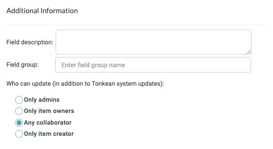
In the Additional Information section, there are several configurable fields:
Field description - Enter a brief description of the field, if relevant. While the field label you create should be as clear and unambiguous as possible, this description can still be helpful for forms that contain multiple similar fields of where some ambiguity is unavoidable. This description displays beneath the field when used on a form.
Field group - Enter a name to assign this field to a field group. This is designed for advanced use cases whereby you can use entire groups of related fields, identified by this field group name, in formulas and other operations.
Who can update - Select who can populate or update the field value. This is an important permissions setting at the individual field level, because it determines who can change a field value after it has been entered.
It is common to use a combination of these settings across different fields on a single item, depending on your use case and specific needs. For example, if you're including several manual fields on an interface that is the intake source for a module, you may want some fields to be editable only by the requester completing the form while other fields (such as a status field) to be editable only by the reveiwer who is processing or approving the request.
Only admins - Only solution administrators can update the field value. Select this option for fields whose values should never be updated except in rare cases, such as correcting errors.
Only item owners - Only users that have been assigned an item in the relevant item interface can update the field value.
By default, there is no owner assigned to an item, so setting this field to Only item owners without assigning a user to that item would result in the field value being locked to all users.
Any collaborator (default) - Anyone can update this field value. Select this option to allow anyone, including external collaborators, to update the field value. Because manual fields are so commonly used for externally-facing forms, this is the default selection.
Only item creator - Only the user who entered the value in the field (for example, the user who completed the form that contains the field) can update the field value. When using a field on a form, select this option to ensure that only the person who completed and submitted the form can update the field value to protect the integrity of the data.
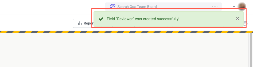
When finished, select Save in the upper right. If the field was created successfully, a success message displays in the top right and the number of manual fields updates to account for the new addition.
Your manual field is now complete and can be used on a form or anywhere else in your module. You can update the field manually on the relevant business report or use the Update Field action to set the value.
Configure a Dropdown Field
Unlike the other field types, dropdown fields require some unique configuration steps. Dropdown fields also provide the power and flexibility to source values from other fields, including matched entities. This flexibility is especially helpful if you want to use dynamic field values as choices in a dropdown menu—for example, if you want to pull values from a connected data source to populate a dropdown list.
To configure a dropdown field, follow the steps below:
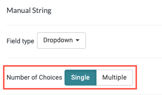
Select whether the field supports Single or Multiple choices (single or multi-select):
Single - Users can select only one option.
Multiple - Users can select one or more options.
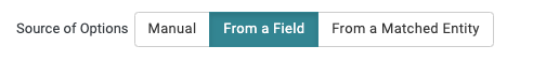
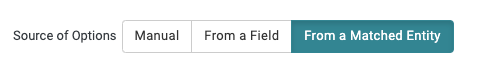
Select the source of the dropdown options:
Manual - Manually enter dropdown options users can select from. Use Manual to set static options that will require infrequent updates.

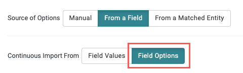
From a Field - Source dropdown options from an existing field. Use From a Field when the options you want to provide exist in a connected data source or in another field.
When you select From a Field, the Continuous Import From options display, with two available settings:
Field Values - Import dropdown options from an existing field. In most cases, this option is used to source values from a separate field that contains a series of values (such as a global field or aggregation field). However, this is not a recommended use, as it offers less flexibility and customization compared to the From a Matched Entity option.
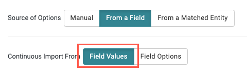
Field Options - Import dropdown options from a connected data source with relevant metadata. Use Field Options to import options from a data source field with a set number of options (for example, you can select a Status field in Zendesk to import the available values for Status and display them as options in a dropdown).
To use the Field Options option, the target data source field must have metadata that identifies the field as a valid selection. We recommend testing the field carefully to confirm it works as expected.
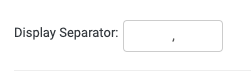
For either selection, confirm the Display Separator. The display separator must be the same separator used in the target field. In most cases, the default separator is a comma.
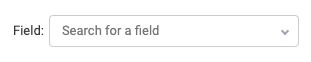
Finally, select the Field to import options from.
From a Matched Entity - Source dropdown options from a matched entity field. Use From a Matched Entity to import options from a connected data source field, importing all values that match the matched entity field condition into your dropdown field.
Select the Field to import options from.
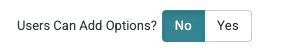
Select whether to allow users to manually add values to the dropdown.
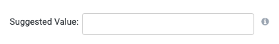
Optionally, set a Suggested Value. When set, suggested values are pre-selected when used in forms and interfaces, but only if a matching option exists in the dropdown and the item value has not been set.
Add manual options for users to select from, then select Next.
If you're importing dropdown options from another field (that is, the From a Field or From a Matched Entity), manual options are provided in addition to the values imported from the external field. In these cases, manual options offer a helpful backup in situations where no relevant or desirable option is available from the external field.
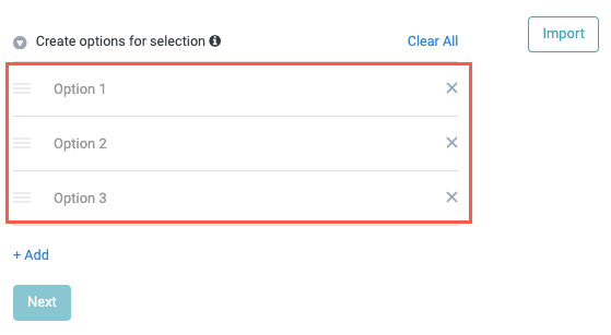
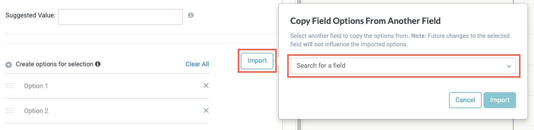
To copy options from another field, select Import and then choose the field from the provided dropdown.
When copying options from another field, these options are not synced. That is, editing or updating the source field options does not update the options in the other field.
Select + Add field label to enter a brief and descriptive label for your field, then select Next to move on to the Display Conditions & Follow-Ups section.
If relevant, select Add Rule to create a rule that determines the display condition and status of the field, based on a specified value. These conditions are useful when you need a module to display differently based on the particular value entered for the field.
Use the conditions dropdown to set the desired condition. The default value is Equal to and the default color Green.
When finished, select Next to continue to the Additional Information section.
In the Additional Information section, there are several configurable fields:
Field description - Enter a brief description of the field, if relevant. While the field label you create should be as clear and unambiguous as possible, this description can still be helpful for forms that contain multiple similar fields of where some ambiguity is unavoidable. This description displays beneath the field when used on a form.
Field group - Enter a name to assign this field to a field group. This is designed for advanced use cases whereby you can use entire groups of related fields, identified by this field group name, in formulas and other operations.
Who can update - Select who can populate or update the field value. This is an important permissions setting at the individual field level, because it determines who can change a field value after it has been entered.
It is common to use a combination of these settings across different fields on a single item, depending on your use case and specific needs. For example, if you're including several manual fields on an interface that is the intake source for a module, you may want some fields to be editable only by the requester completing the form while other fields (such as a status field) to be editable only by the reveiwer who is processing or approving the request.
Only admins - Only solution administrators can update the field value. Select this option for fields whose values should never be updated except in rare cases, such as correcting errors.
Only item owners - Only users that have been assigned an item in the relevant item interface can update the field value.
By default, there is no owner assigned to an item, so setting this field to Only item owners without assigning a user to that item would result in the field value being locked to all users.
Any collaborator (default) - Anyone can update this field value. Select this option to allow anyone, including external collaborators, to update the field value. Because manual fields are so commonly used for externally-facing forms, this is the default selection.
Only item creator - Only the user that entered the value in the field (for example, the user that completed the form that contains the field) can update the field value. When using a field on a form, select this option to ensure that only the person who completed and submitted the form can update the field value to protect the integrity of the data.
When finished, select Save in the upper right. If the field was created successfully, a success message displays in the top right and the number of manual fields updates to account for the new addition.
Your manual field is now complete and can be used on a form or anywhere else in your module. You can update the field manually on the relevant business report or use the Update Field action to set the value.